How to use CSS grids to create the layout of a web page
CSS grids is a native CSS layout system and came to replace the grids systems that were developed in an artisanal way (using floats initially and now with flexbox) to create the layouts of web pages and web applications.
What CSS grids allow you to do is organize the layout elements of a page in a more logical way, with less code and more flexibility.
Developing a layout with CSS grids
Let's work with a common layout that has the basics:
- Header
- Sidebar
- Content (main)
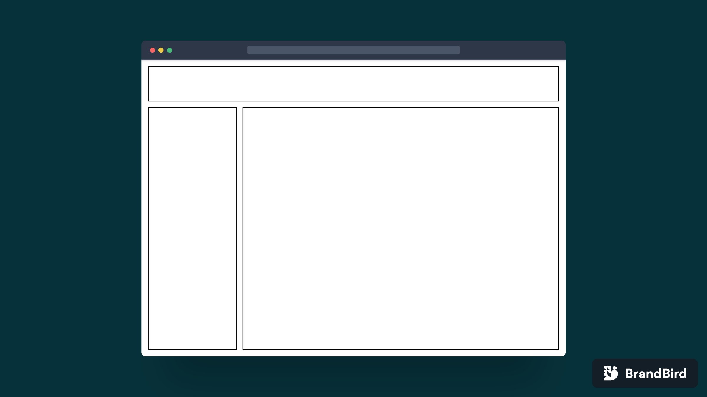
The HTML code
The first step is to create the HTML. It's just a parent with three children. Nothing out of the ordinary.
<div>
	<header></header>
	<aside></aside>
	<main></main>
</div>
The .page parent is in charge of defining the grid.
Adding the CSS bases
This layout we are creating has 100% height and width, to achieve this we have to define the CSS of the html and body. Also for demo purposes we are going to add a border to the header, aside and main.
body, html {
	padding: 1rem;
	height: 100%;
	width: 100%;
}

header, aside, main {
	border: solid 2px;
}
Creating the grid container
To define the grid, we set the parent .page to display: grid. This will create a "grid container " and will make all the direct children become "grid items ".
.page {
	display: grid;
}
This is how our page looks like
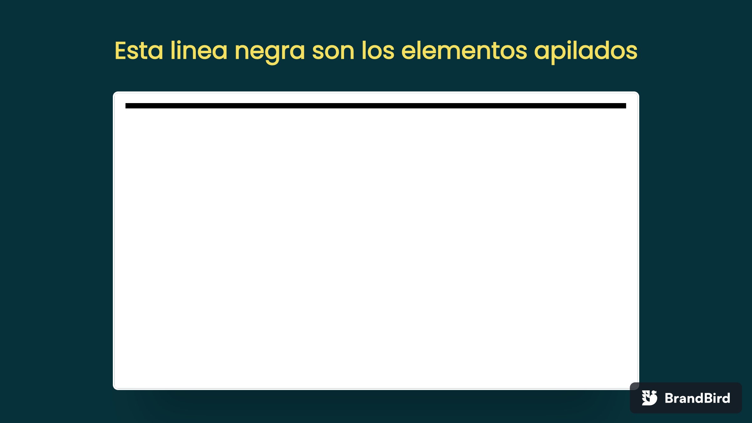
It looks like a line and already, but really they are the children of .page stacked. The result is the header, aside and main stacked one on top of the other. Why, well because neither .page nor its children have height or content that makes them occupy space.
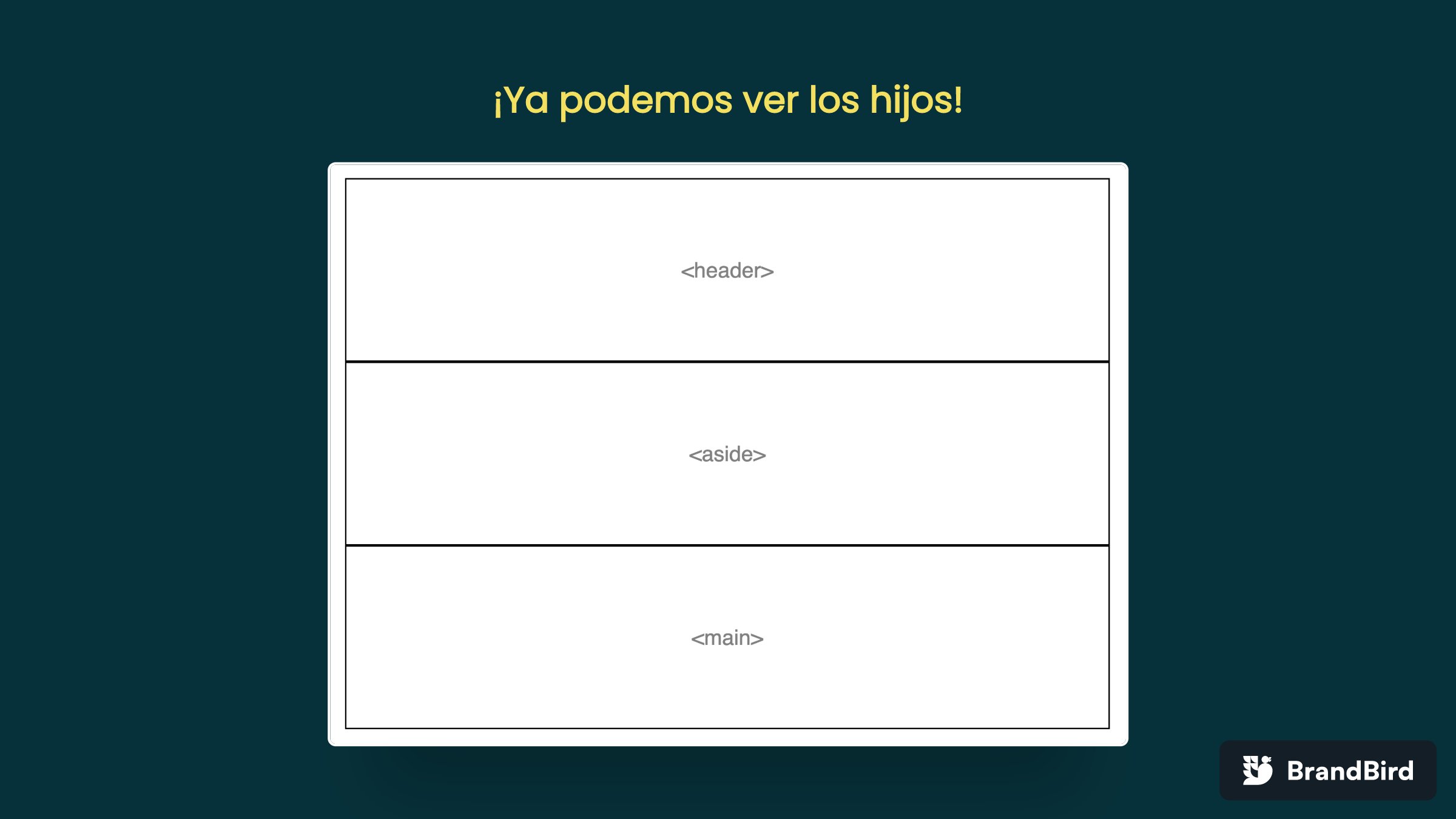
We add height of 100% to the .page and with this we see the children. By default the grid creates the spaces with the same height and the same width, because we have to define that with rows and columns.
.page {
	display: grid;
	height: 100%;
}
Defining the grid sections
First we are going to define columns with the grid-template-columns: 250px 1fr property.
The values of this property separated by space represent the width of each columns in the grid, two values make two columns, three values, three columns and so on.
.page {
	display: grid;
	height: 100%;
	grid-template-columns: 250px 1fr;
}
The first column is 250px and the second 1fr.
fr is a CSS unit meaning "fraction" which represents a fraction of the available space.
For example if the .page is 1000px as the first column is 250px the second column (1fr) will be 750px.
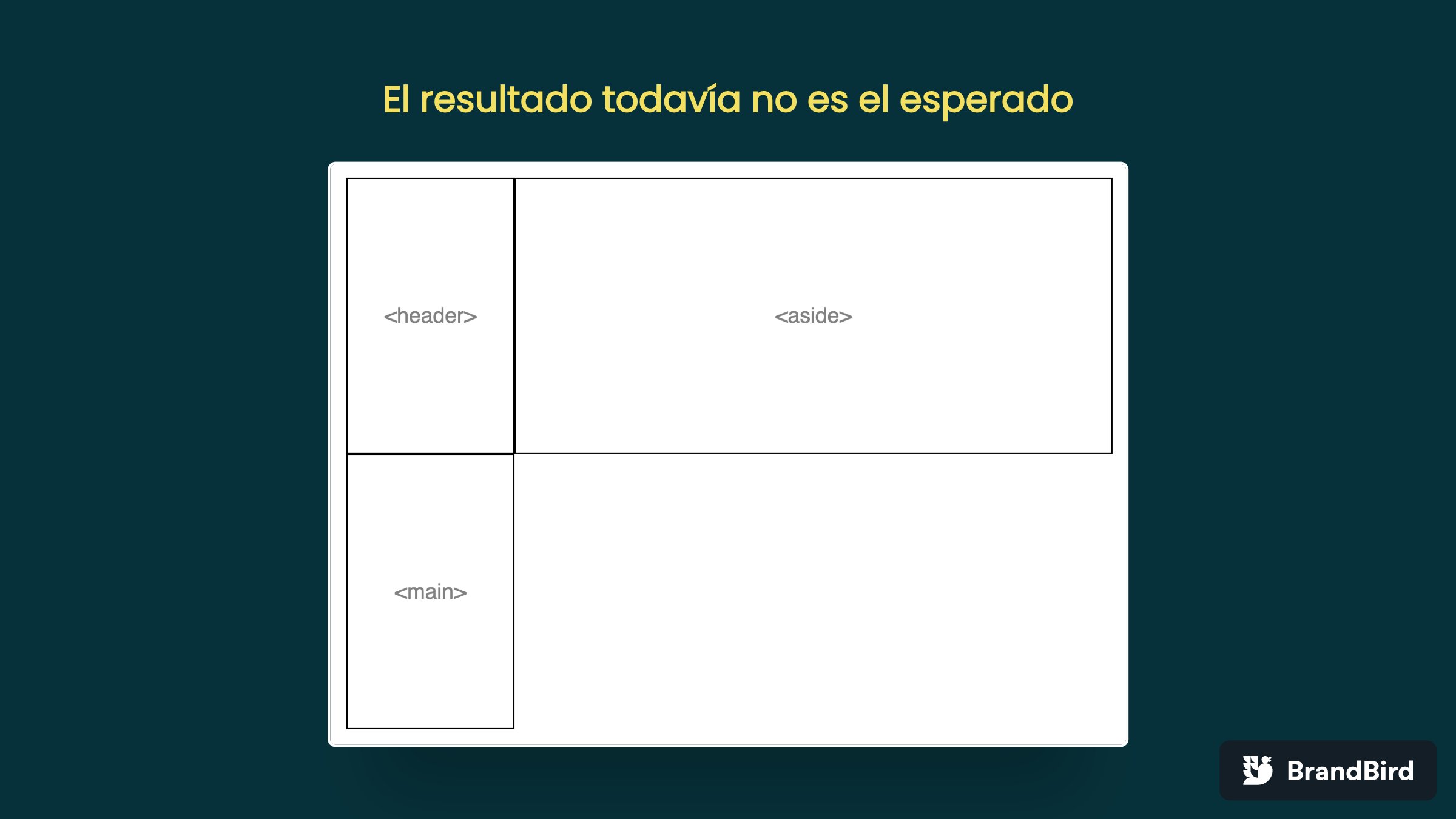
The result is still not as expected. Why?
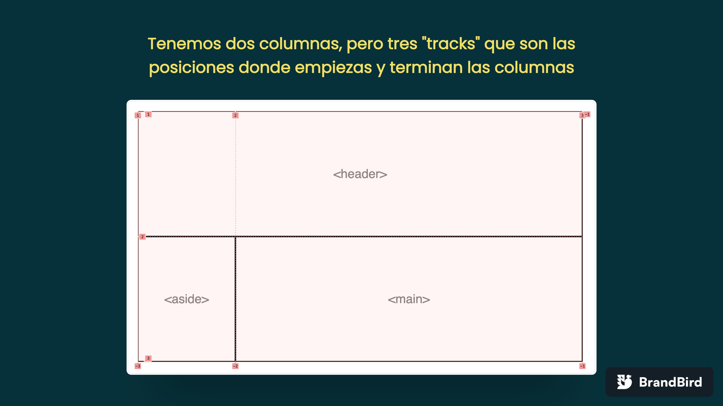
The grid has 2 columns defined, but it has 3 children. So the first two children (header and aside) take the first 2 columns of the first row, but the third child "goes" to the second row.
To fix this we have to make the header occupy the two columns of the first row.
We do it with the property "grid-column" the value represents the tracks that we want to occupy separated by "slash", in this case the header goes from 1 to 3.
header {
	grid-column: 1 / 3;
}
Setting up rows
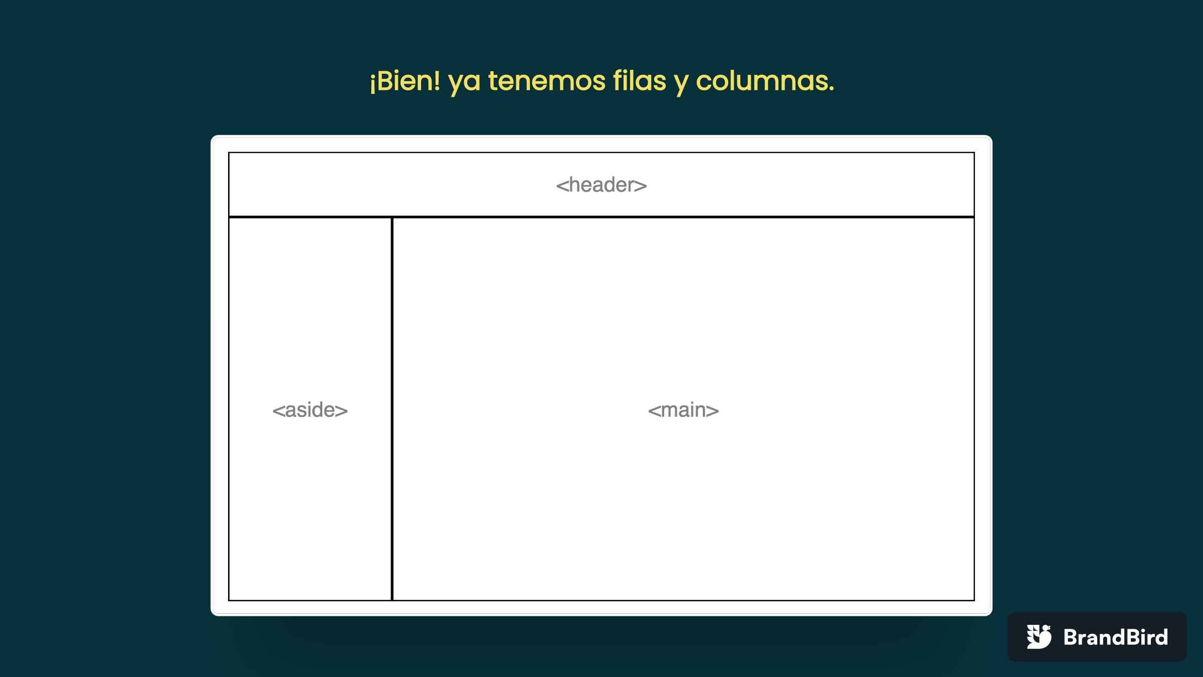
Now we need the <header> to be 100px high, for this we need to define rows.
The grid-template-rows property allows us to define the height of the rows and works the same as the columns, we set it to 100px 1fr.
.page {
	display: grid;
	height: 100%;
	grid-template-columns: 250px 1fr;
	grid-template-rows: 100px 1fr;
}
Last details
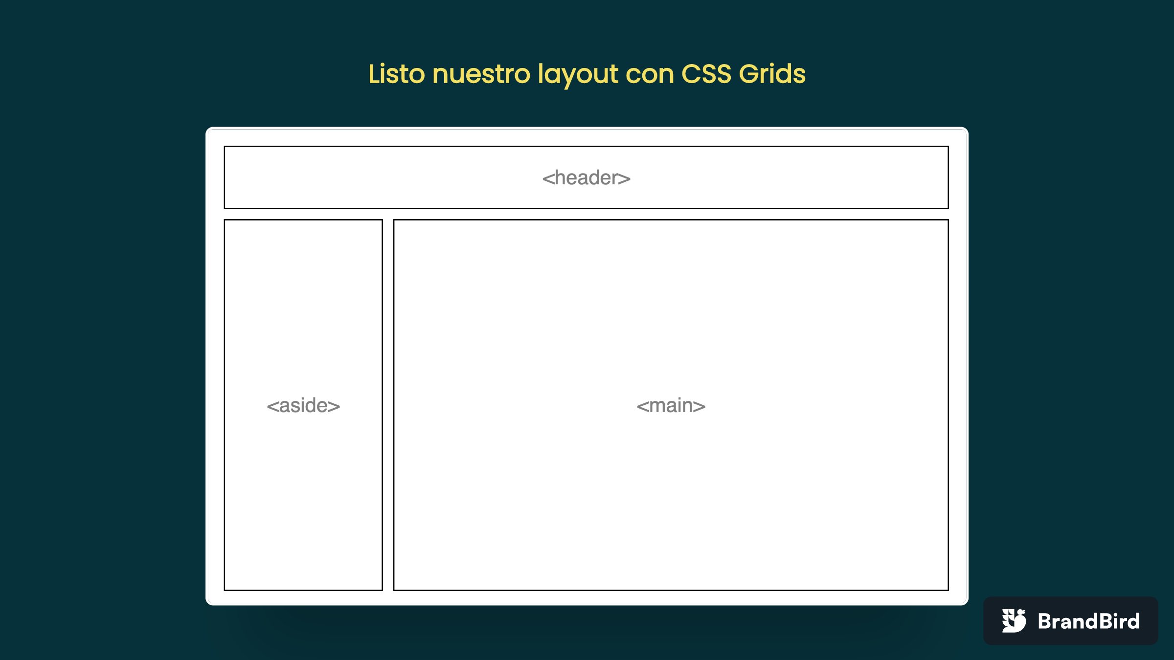
In the design we have "margins" between the elements, to do this we use another grid property called "gap" that allows us to put a space between each element of the grid.
.page {
	display: grid;
	height: 100%;
	grid-template-columns: 250px 1fr;
	grid-template-rows: 100px 1fr;
	gap: 1rem;
}
Conclusion
CSS grids is the native solution to define the layout of your page. Just define the grid container with display: grid and define columns and rows with the grid-template-columns and grid-template-rows properties respectively.