
10 tips for designing better UI interfaces
Do you have some UI design work you want to complete? Maybe you are a designer or developer trying to complete some UI work for your clients. I wrote this article with tips and resources to help designers and developers improve their designs.
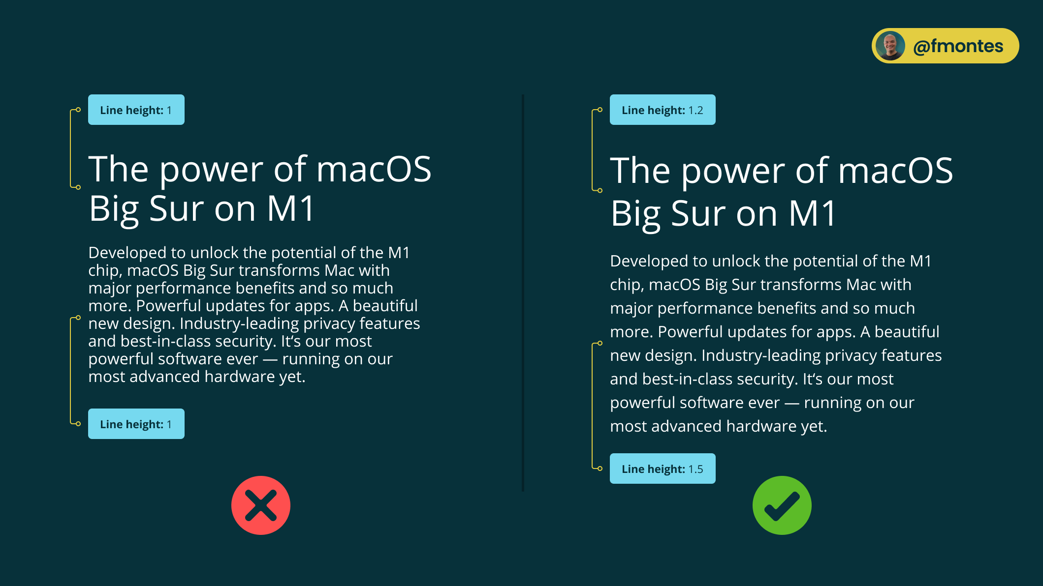
1/10: Watch the line spacing
Over 95% of the information on the Web is in text format. This is why it's important to make sure readability is at its peak and the right line height improves readability.
The typical recommendation is that the line height should be 1.5 and although this is fine you can do better.
Large body text such as headings can use 1.2 or even 1.1 and as you reduce the size you increase the line height, since the smaller the text the more line space is needed to easily identify each line.
In paragraphs that typically range between 14 and 16px, 1.5 is recommended.
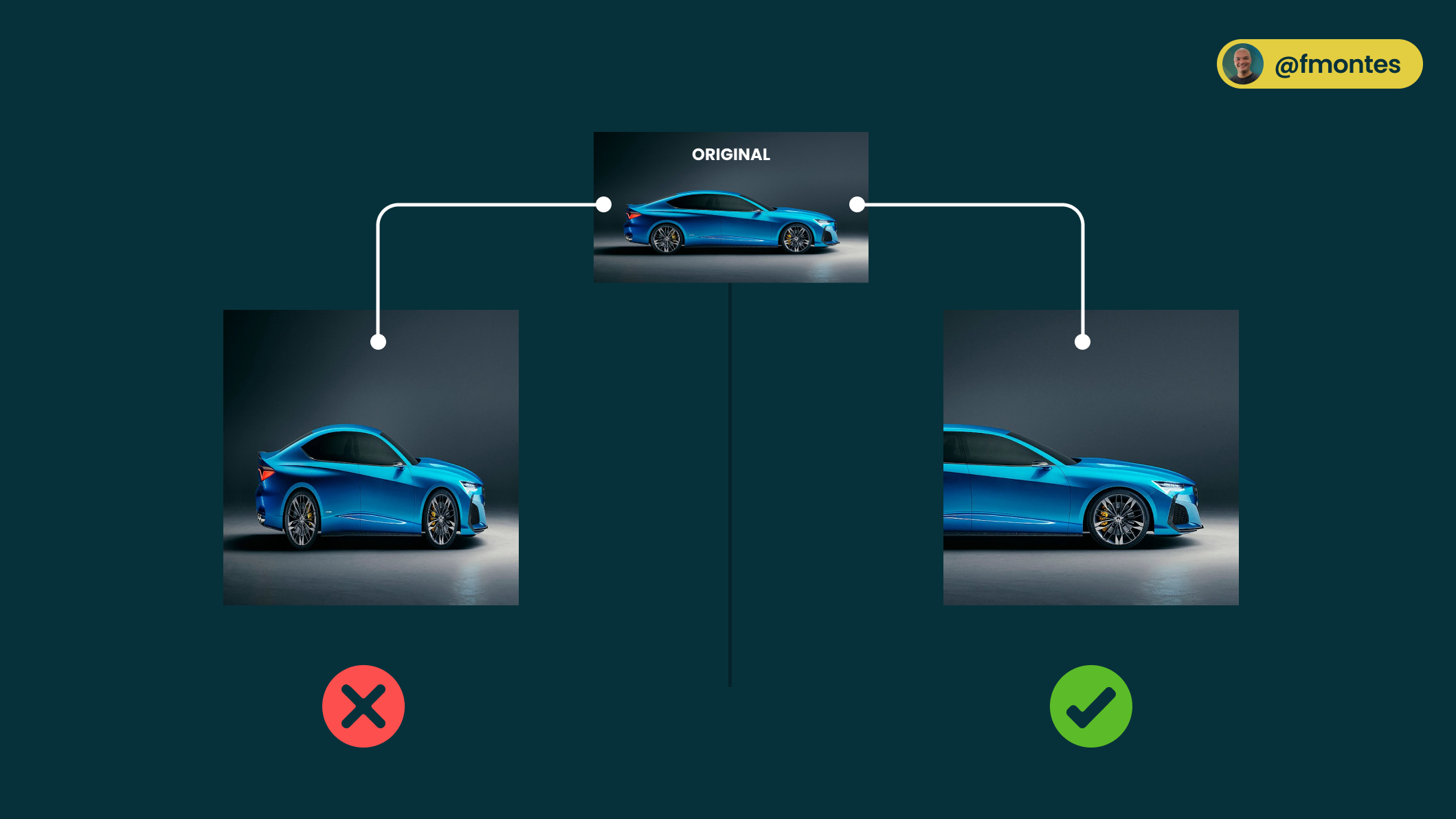
2/10: Do not distort pictures
A bad photo can destroy a design, but a warped image makes you look like an unprofessional programmer and designer.
Make sure that when you resize images they do not warp and that you do this by respecting the aspect ratio.
An aspect ratio is a proportional relationship between the width and height of an image. Basically, it describes the shape of an image.
What you have to do when you resize the image is make sure you change the width and height proportionally. Image editors allow you to resize proportionally by making the change with the Shift key pressed.
If it is with CSS you can use the aspect-ratio property to proportionally resize the image to the desired size.
If for some reason you have to change the aspect ratio what you have to do is crop the image instead of just resizing it.
3/10: Not justifying paragraphs
Justifying text creates large spaces between words, this is called "rivers of white" and this hinders the readability of the text.
The problem with these spaces in body text is that it causes readers to get lost repeatedly and this difficulty is further increased in dyslexic readers.

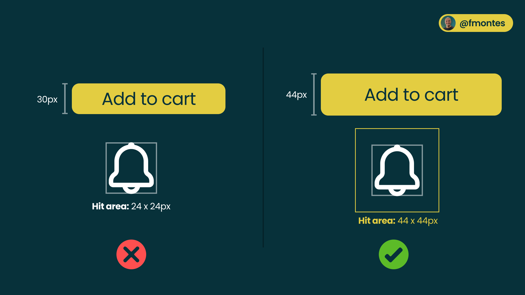
4/10: The hit area should be at least 44px.
Nowadays, a lot of devices have touch screens, we are not only talking about tablets, many laptops especially Windows laptops have touch screens.
Having buttons with at least 44px height is for or 10mm (which is the average adult finger size) allows the buttons to be easily touchable by most users.
Icon buttons can have the smallest icon, but as a developer you have to make sure that the touch area is at least 44 x 44px.
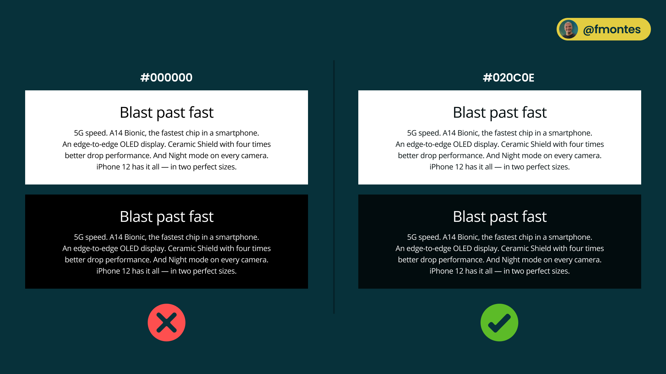
5/10: Do not use pure black #000000
Using pure black (#000000) completely eliminates the light emitted from the screen, this makes the eyes work harder.
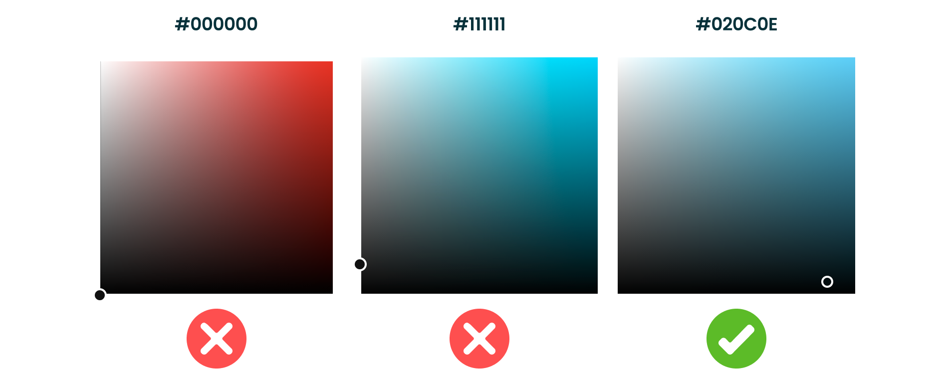
Both in the background and in the color of the typography it is best to use a very dark gray. Pure grays are not found in nature so to give a more natural "look and feel" it is best to make a dark gray with a base color.
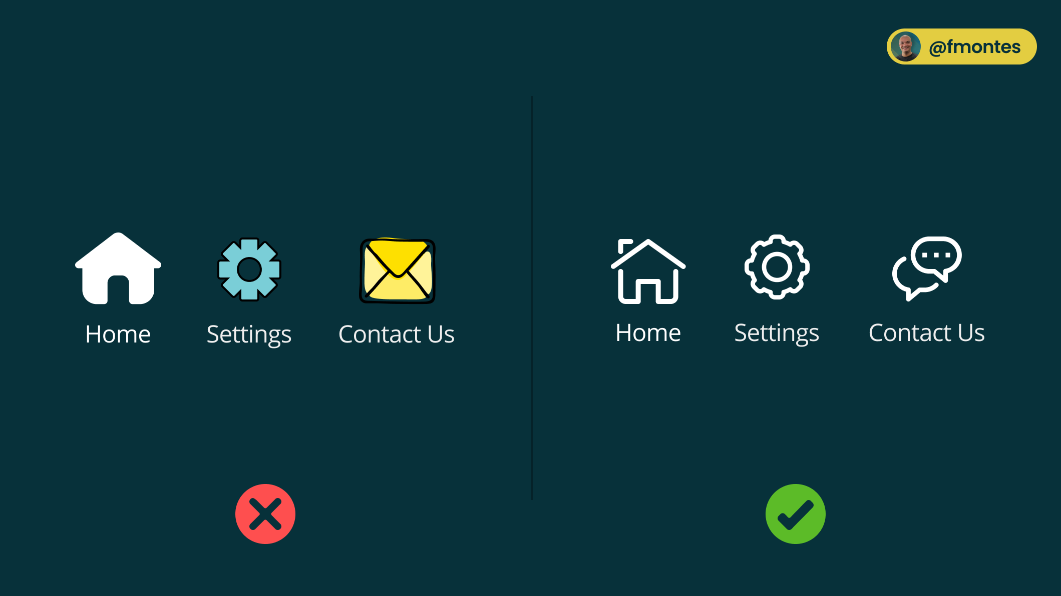
6/10: Use icons from the same family
Another reason that can kill a design quickly is lack of consistency, this is why it is very important that when selecting icons for your design make sure they belong to the same family.
At iconfinder.com you can find a lot of icon families, some free and some paid. On the other hand, you could use established icons like Material Icons from Google or Font Awesome.
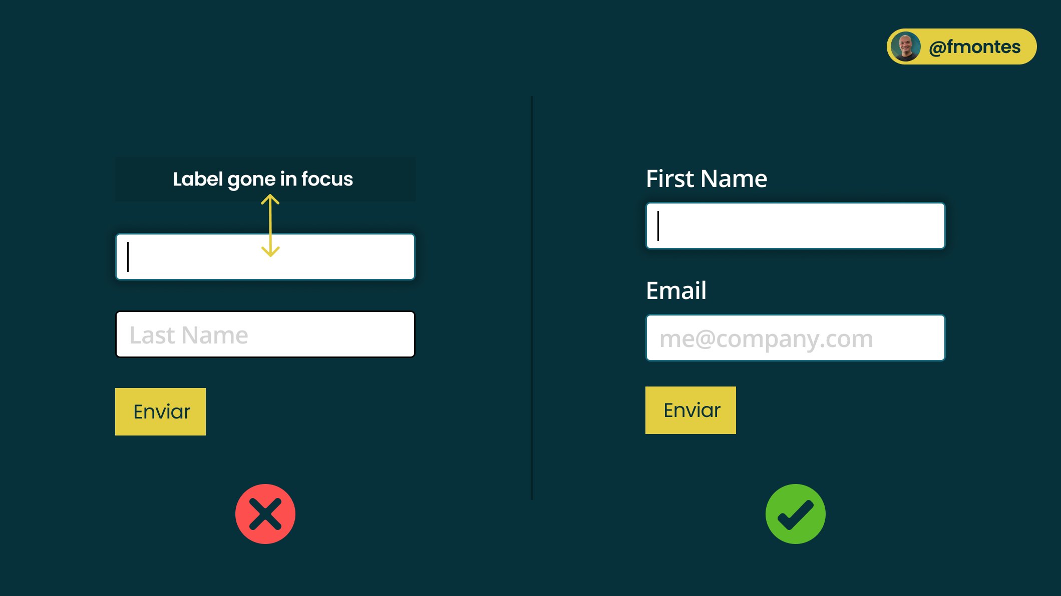
7/10: Do not use placeholders as labels
Using placeholders as labels may seem like a good solution because the forms look less cluttered, but in the realm of accessibility and user experience it is a bad experience.
The placeholders disappear when the field is in focus which makes the user to get lost and forget what is the information to enter in the field.
If you want to use labels inside the field don't use placeholders you can use "floating labels" popularized by Google in Material Design.
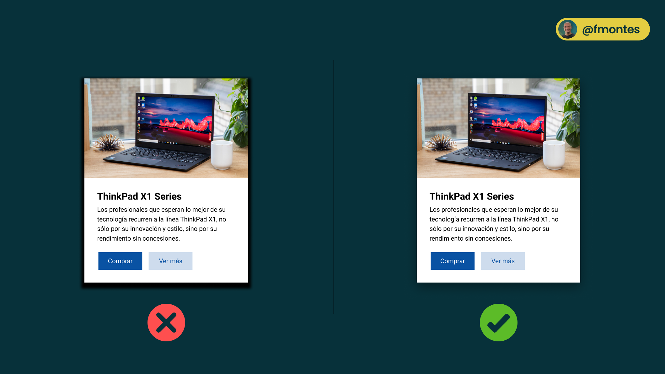
8/10: Don't make shadows too strong
Shadows in designs are valuable, although they are mostly used as decoration the reality is that they can be a very good user experience resource: the bigger the shadow the "closer" to the user the element is perceived.
When using shadows:
- Raise the blur between 20 and 40px works well.
- Do not use pure black or gray, you can use a very dark color based on the background color or a very dark blue.
- Lower the opacity, shadows in the real world (unless you're in full midday sun on a beach) are not very sharp, try to emulate that.
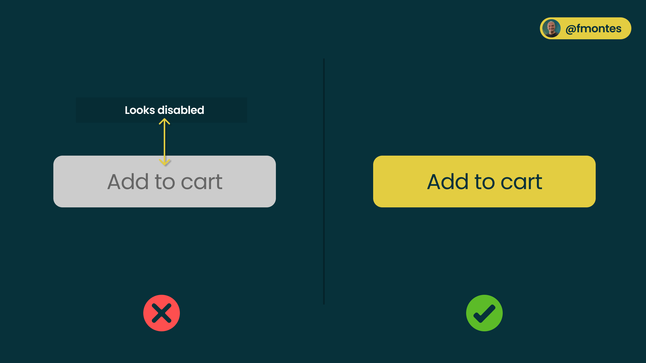
9/10: Don't use gray and low contrast buttons.
Gray color within the interface design is associated with something that is "disabled" or with an action that cannot be done.
For buttons make sure to use a primary color from your background color palette and a color that contrasts well with the text color.
Buttons are elements for which you almost always want to attract the user's attention. It is also advisable to have at least two button styles: primary and secondary.
10/10: Do not use centered text in long paragraphs.
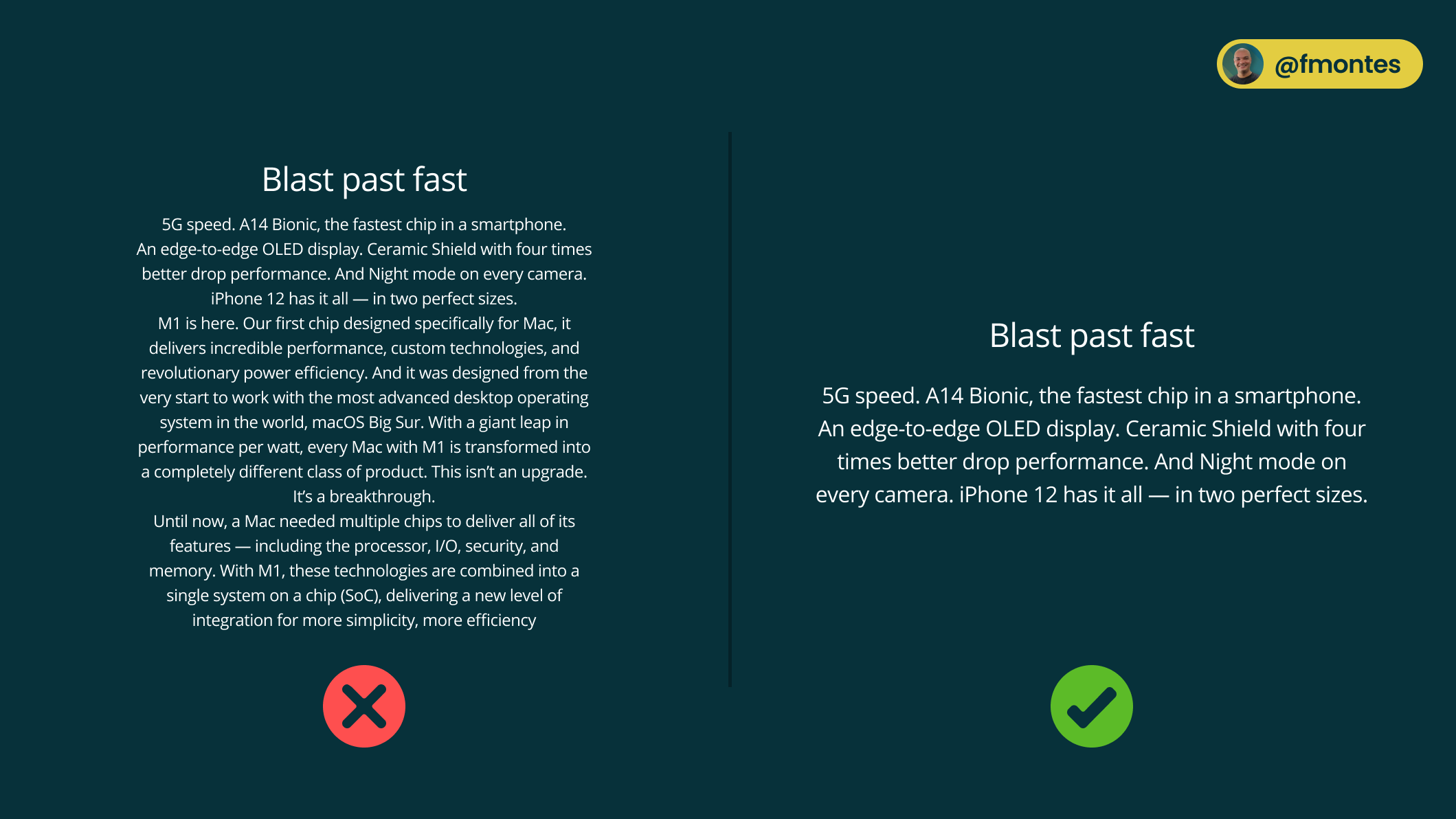
Centered text is a good resource, visually it looks good because of the symmetry it presents, but it can be a double-edged sword.
Very long paragraphs (more than 4 lines) do not work well to have all the text centered, this works with short paragraphs and even better if they are not very wide.
If you are going to center paragraphs make sure they are 4 lines or less and hopefully less than 50 characters wide.
Conclusion
None of these rules are written in stone, it's good to know them so you can make more informed design decisions.
I hope this article provides you with some useful tips and techniques that you can immediately apply to your own projects. Whether you design websites, apps or other interfaces, always remember: test your designs with real users if possible, and ask your team for feedback. These small steps can have a big impact on the final result.